Mastering Brand Colours for Effective Branding Strategies

Hey there, creative friend! Grab a coffee, because we’re diving deep into the world of colour psychology! That’s right, the hues you choose for your brand aren’t just about aesthetics (although, let’s be real, those are important too!). Colour is more than just a visual element in branding; it’s a silent language that speaks volumes about your brand identity. It has the power to evoke emotions, convey messages, and leave a lasting impression on your target audience. Understanding colour psychology is a strategic move that can significantly impact brand recognition, customer engagement, and ultimately, attract your dream clients.
Why Colours in Branding Matter?
Colours play a crucial role in shaping how customers perceive your brand. They’re like tiny emotional billboards that scream your brand message to the world. Here’s how a well-chosen colour palette can benefit your brand:
Improve Brand Recognition
Colours are a huge part of your brand’s signature style. They create a visual identity that makes your brand stand out. Studies show that within 90 seconds of interacting with a brand, up to 60% of people base their judgement on colour alone. Consistent use of a killer colour palette across your logo, website, marketing materials, and social media presence helps customers recognise your brand instantly. Think of Tiffany & Co.’s iconic robin’s egg blue or Barbie’s millennial pink.
Showcase the Right Brand Values
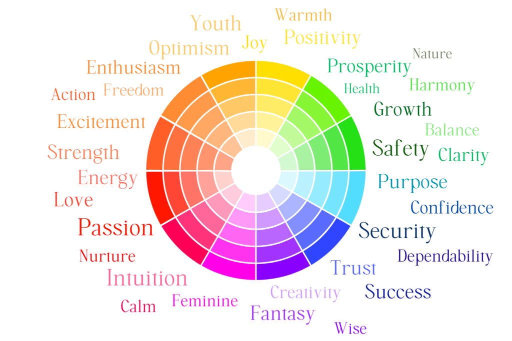
Colours have inherent meanings and associations that can communicate your brand values effectively. For example, blue conveys trust and security, making it a popular choice for banks. Green, symbolising nature and growth, is often used by eco-conscious brands. Align your colours with your brand’s core values and watch your audience connect with you on a deeper level.
Increase Customer Engagement
Strategic colour choices can be like tiny conversation starters, influencing how customers interact with your brand. Warm colours like sunshine yellow can energise your audience, while cool colours like calming blue can create a sense of peace. Understanding these psychological tricks can help to create a user experience that gets people hooked, like that irresistible “Buy Now” button in a fiery orange that just begs to be clicked and drive conversions.
Attract Dream Clients
Colours can be your secret weapon for attracting your ideal customers. Think about your target audience – what kind of vibe are you going for? Consider their demographics and psychographics and what emotions you want to evoke in them. For example, a creative brand targeting extroverted millenials might use bold reds, and a bright pink to create an eye-catching palette that screams “Look at me!” and grabs attention faster than you can say “double espresso”. Meanwhile, a brand focused on mindfulness and meditation might choose a calming palette of soothing beiges and tranquil blues. Understanding your audience’s colour preferences lets you create a brand identity that speaks directly to their hearts (and wallets!).
What Does Each Colour Mean in Branding?
Understanding the psychology behind different colours is essential for choosing the right palette for your brand. Here’s a breakdown of some common colours and their associations in branding:
- Colour Psychology of Red
Bold, passionate, and attention-grabbing – like a siren song for those who crave excitement. But be careful, too much red can be overwhelming, so use it wisely!
- Colour Psychology of Orange
Vibrant, energetic, and bursting with creativity. Perfect for brands that want to stand out and be the life of the party.
- Colour Psychology of Yellow
Sunshine and happiness personified! Yellow radiates optimism and warmth, making it ideal for brands that want to create a cheerful and inviting atmosphere.
- Colour Psychology of Green
Nature, growth, and balance – all rolled into one beautiful colour. Green is a versatile chameleon that can represent sustainability or a connection to the great outdoors.
- Colour Psychology of Blue
Trustworthy, reliable, and oh-so-professional. Blue is a popular pick for banks and tech companies for a reason – it creates a sense of calm and stability.
- Colour Psychology of Purple
Luxurious, sophisticated, and brimming with creativity. A touch of purple adds elegance and a hint of mystery to your brand.
- Colour Psychology of Pink
Feminine, playful, and full of warmth. Pink is often used by brands targeting a female audience or those selling products associated with gentleness.
- Colour Psychology of Beige
The ultimate chiller, beige creates a sense of calmness and comfort. It can be used as a background colour to let other colours shine or to create a minimalist aesthetic.
- Colour Psychology of White
Purity, cleanliness, and simplicity personified. White creates a sense of openness and can make your brand appear modern and fresh.
- Colour Psychology of Black
Sophistication, power, and pure elegance. Black can be used to create a sense of luxury or to make a bold statement.

How to Choose the Right Colours for Your Branding
But hold on a sec, it’s not just about picking one colour and calling it a day! Choosing the right colours for your brand is a crucial step in creating a strong and memorable brand identity. Here are some steps to guide you:
- Define Your Brand Identity:
Before you go all Willy Wonka on the colour wheel, start by clearly defining your brand’s core values, mission, and target audience. What makes your brand unique? Who are you trying to reach? Understanding these elements will help you choose colours that align with your brand message.
- Consider the Colour Psychology:
Research the psychology behind different colours and their associations (as above). How do you want your customers to feel when they interact with your brand? Choose colours that evoke the desired emotions.
- Spy On Your Competitors (but don’t copy):
While you don’t want to be a copycat, it’s always good to be aware of what’s happening in your industry. Check out your competitor’s colour palettes, but use this info to find your own unique colour combos that will make you stand out from the crowd.
- Create a Mood Board:
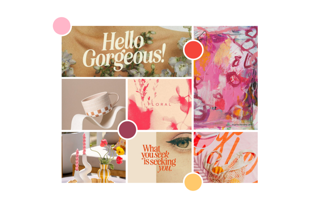
Here’s where things get fun! Collect images, colour swatches, and logos that inspire your brand identity. This will help you visualise different colour combinations and see how they work together. Our favourite way to mood board is to save everything to it’s own Pinterest board.
- Test and Refine:
Don’t be afraid to experiment with different colour combinations. Get feedback from your target audience (not your mum, your best mate and that neighbour from a few doors down – unless they’re your target market!) to see how they react to your colour choices. You can use A/B testing tools to compare the effectiveness of different colour schemes on your website or marketing materials.

Branding Colour Generators
While there’s no substitute for a human touch, online colour generator tools can be a helpful starting point. Here are a few of our faves:
- Adobe Color: This free tool by Adobe allows you to create colour schemes based on various rules like analogous, complementary, or triadic harmonies. You can also explore themes and moodboards for inspiration.
- Coolors: Another user-friendly tool, Coolors lets you generate colour palettes by locking specific colours or adjusting the colour scheme’s mood.
Colour psychology is your secret weapon for building a magnetic brand. By understanding the power of colour, you can create a brand identity that resonates with your target audience, strengthens brand recognition, and ultimately attracts your dream clients. Experiment, have fun, and don’t be afraid to let your unique personality shine through – keeping your dream clients in mind of course (and just maybe avoid clashing neon green and hot pink – your website visitors might need sunglasses!).
Remember, choosing the right colours is an investment in your brand’s future. So take your time, experiment strategically, and don’t be afraid to get creative! With a well-chosen colour palette, your brand will be a masterpiece waiting to be seen. Now go forth and conquer the world with your colour magic!
Feeling overwhelmed by the colour wheel? No worries, that’s what we’re here for! We can help you unlock the power of colour psychology and create a brand that’s as vibrant and unique as you are! Feel free to contact us to chat all things branding.